My Portfolio's Crystal Has No 3D Model. It's All Shader Math
What This Post Is About
This post is about how I made the crystal, the main character of my portfolio.
Most people might assume I exported a 3D GLB model and dressed it up with three.js effects. Nope. The crystal star is 100% shader. No three.js, no model file. The whole thing is calculated from math.
Here's the thing though. As an interactive designer, I'm still learning shaders. So this time, I set the direction, AI wrote the code, and once the effect looked right, I went back and asked it to explain how everything works. Magical, right? I think it's super cool too. This post walks through that process, plus the things I learned along the way.
Where the Idea Started
Since this is my own portfolio, I wanted to start from how I design. I love being rigorous and focused. And because I love astronomy, planets, and stars, I wanted to make something that feels like a star chart.
My usual first step is looking for references on Pinterest, because flat graphics give me lots of room to imagine. I found an astronomy star-chart visual I really loved. And then... I got stuck.
In the past, whenever I made 3D, it always went the same way. Find a model online, pull it into Blender, tweak it, export it. But looking at that flat reference, I felt like this routine would limit my ideas. I'm no Blender master, so I wasn't sure I could build an asset from scratch. And models from the internet were never made for me, so adjusting them takes a lot of time. For a stage where I was still experimenting and looking for a direction, the whole process just didn't work well.
So on a whim, I just asked AI to make it for me. What surprised me was that it did all this exploring with shaders.
Hitting Walls and Trying Things
At first I wasn't sure about the direction at all, so I tried a lot of versions, like outer space and planets. But that theme has been done to death on the internet, and it wasn't new for me either. My last portfolio already had Saturn as its hero.
So I turned to light. Looking back at the references I loved, every single one did something special with light and shadow. Maybe that was the thing I was actually drawn to all along. I tried louver gratings, a vinyl record, even a transparent crystal flower, all visuals where light gets to do a lot.
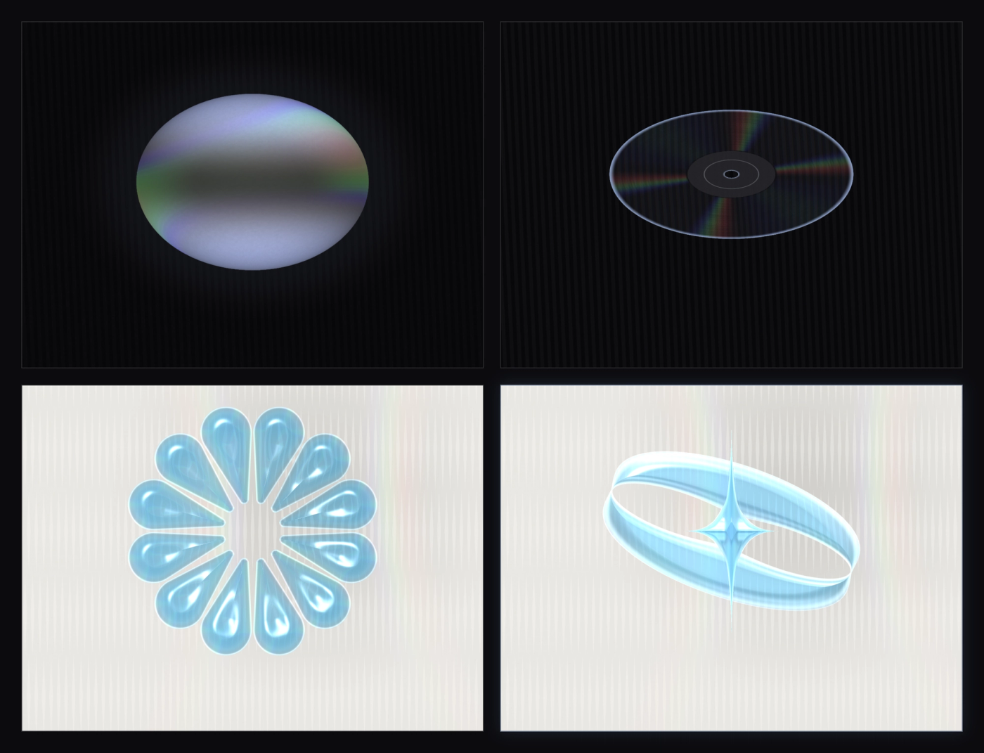
But after going around in circles, the one I kept coming back to was still the starry one, this four-pointed star with its orbit ring.
Thinking about it now, if I had really started from Blender, trying all those versions would have taken so long I probably would have given up halfway. But wait. How does a shader even do this?
What I Learned From Building It
I've noticed I keep learning new things the same way now. First use AI to help me build an effect, tune it until I'm happy, then go back and ask AI how it actually works underneath. This crystal was no exception.
I had never seen a shader make a full "model" like this before. Later I found out a lot of shader masters work exactly this way. Here are a few ideas from this build that I know I'll use again in other projects:
1. A model can be one math formula inside a shader
I used to think 3D always needed a model file, a bunch of vertices connected into a mesh. Turns out, a "model" inside a shader can just be a distance function. Give it any point in space, and it tells you "how far is this point from the surface." A sphere is literally one line, length(p) - 1.0. My four-pointed star and orbit ring are the same kind of formula, just fancier.
Here's why this matters to me. For future visual experiments, I'm changing a math formula, not dragging a model around in Blender. It stays sharp no matter how big you scale it, the file is tiny, and changing the shape just means changing the formula, so I can try new versions really fast. That's exactly how I got through the disc, the vinyl, the crystal flower, and the star without getting tired of it.
One thing I should mention. That sphere formula is the full 3D version, and my crystal is actually the flat version of it. More on that in point three.
2. Light isn't painted on, it's calculated, so it's interactive by nature
The shine and rainbows on the crystal are calculated on the spot. As long as you know which way the surface is facing, where the light is, and where the eye is, you can work out the lighting from how those three relate.
Take the rainbow along the crystal's edge. Behind the scenes, the program measures the angle between your line of sight and the light, relative to the surface. That angle maps to a wavelength, and one more formula turns the wavelength into the color your eye sees. Change the angle, and the wavelength changes, and the color changes with it.
It's the same thing as the rainbow on a CD. Tilt the disc and the rainbow moves across it, because at each angle, only one specific wavelength bounces into your eyes.
And the coolest part? Because it's all calculated, it's interactive by nature. The cursor is literally a lamp. Wherever it moves, the highlights and rainbows follow it around, and I never wrote a single line of "interaction" code. I just feed in the light's position every frame. That was the big lesson for me. When visuals are calculated from parameters and real-world rules, interaction and animation come almost for free. For someone who designs interaction for a living, that idea was mind-blowing.
3. My crystal is actually 2.5D, not true 3D
There's a secret you can't see from the front. The crystal only builds the one side facing the camera. It's a flat shape, using fake thickness and fake surface angles to look 3D, more like a relief carving than a real ball you could walk around. You can't spin it to see the back, because there is no back.
True 3D (a technique called raymarching) actually sends light rays into the shape, so there's a real back side, you can rotate it any way you want, and the refraction really passes through the glass. It just costs a lot more performance than my 2.5D.
So why did I pick 2.5D? It's cheap, it runs on old phones, and the shape stays just as sharp. My crystal is the homepage hero, so it's meant to be seen from the front anyway. It never needs to show its back. For this job, 2.5D is simply the right trade-off. It looks like 3D glass, and it runs smooth. The real 3D version? I'm saving that one for my next experiment.
This Time, and Next Time
The hardest part of building this portfolio was exactly what this post covers, going from endless ideas down to one hero visual. The design and build that come after matter too, but once the hero's direction is set, the rest honestly isn't that hard.
What I'm happiest about this time is writing a "model" out of pure shader math. I unlocked a new skill, learned one more way to use shaders, and best of all, my future visual experiments no longer have to go through Blender. With math and code, I can try ideas way faster.
I'll admit I had a lot of wilder ideas that never made it in, because I was afraid they would get in the way of reading or make things hard to find. I want my portfolio to keep doing its one job, which is letting people actually read it. No matter how cool an effect is, if the site can't do what it's supposed to do, it means nothing.
I know this won't be my last portfolio. Next time, I hope I can use more effects comfortably without overwhelming anyone, and try more original visuals without making people feel lost. I just want to keep building experiences that are fun to be in!